top of page


INFOGRAPHIC
"As few as possible — As much as necessary"
The combination of text and images describe my daily effort to reduce my abundant needs in everyday life in order to preserve our nature. The illustrated objects of my home are topics and tips for different opportunities to reduce waste, save energy, stop pollution, save money etc.
PERSONAL PROJECT
SERVICES
-
Content
-
Copywriting
-
Illustrations
-
Layout
-
Prepress

Font Pairing
Color Palette
VISUAL COMMUNICATION
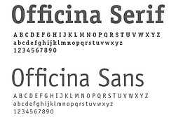
The illustrations on a beige background use negative white areas to draw attention to the content. Subtle accent colors in red, green and yellow highlight the most important information, and I chose a harmonious font pairing from the same family for the typography. The serif font elegantly highlights the titles and creates a clear visual hierarchy, while the sans serif font ensures consistency and legibility in the body text.

bottom of page